Wondering where to find the best online courses for learning data visualization? Are you looking to transform your skills and bolster your resume? Or perhaps you’re simply intrigued by the visual representation of data and want to dip your toes in this fascinating field?
In our data-driven world, learning data visualization has become crucial. It’s the art of putting abstract information and numerical statistics into a visual context, making complex data more understandable, accessible, and usable.
Data visualization is more than just aesthetically pleasing graphs or charts; it’s a powerful tool that helps businesses make informed decisions, predict trends, and communicate information effectively and efficiently. So, if you’re ready to dive into this exciting field, continue reading our guide to the ‘best online courses for learning data visualization’ and start transforming your skills today!
Contents
- 1 What is Data Visualization?
- 2 6 Best Online Courses For Learning Data Visualization
- 2.1 1. 2023 Python Data Analysis & Visualization Masterclass
- 2.2 2. Complete Machine Learning & Data Science Bootcamp 2023
- 2.3 3. Data Storytelling and Data Visualization Mastery
- 2.4 4. Ultimate Data Analytics and Visualization Bundle: 10 Courses
- 2.5 5. Learn Data Visualization with Tableau 9.1
- 2.6 6. Apache Zeppelin – Big Data Visualization Tool
- 3 Discover Exciting Opportunities in the Field of Data Visualization
- 4 Frequently Asked Questions
- 5 Final Words
What is Data Visualization?

Data Visualization is a potent blend of science and art that seeks to communicate data clearly and efficiently through graphical representation. It involves creating and studying visual renderings of data, leveraging our natural ability to perceive patterns and trends.
From heat maps and bar charts to scatter plots, the techniques and tools used in data visualization translate raw data into a format that can be easily understood and interpreted. With its power to make complex data more understandable and actionable, data visualization plays a pivotal role in numerous industries, including business, health, and public policy.
6 Best Online Courses For Learning Data Visualization
Ready to get started with learning data visualization? Check out our list of the six best online courses for learning data visualization.
1. 2023 Python Data Analysis & Visualization Masterclass
For those keen on mastering Data Visualization using Python, the 2023 Python Data Analysis & Visualization Masterclass offered on Udemy is indeed a game-changer. This course empowers you to grasp the nuts and bolts of Python’s Data Analysis libraries and Matplotlib, thereby enhancing your skills in a practical, hands-on manner.
At the core of this masterclass, you will learn to wield the power of Pandas’ Dataframes and Series. You can explore its vast capabilities with a uniquely designed curriculum that ensures a thorough understanding. The course also offers a deep dive into the intricacies of Matplotlib. It’s a robust tool for creating static, animated, and interactive visualizations in Python.
Perhaps one of the most intriguing aspects of this course is its emphasis on learning through doing. You can create line, box, scatter, bar, pie, rug, swarm, violin, strip, and other plots, enabling you to translate theoretical knowledge into practical experience. With an array of exercises and challenges available for practice, you’ll be well on your way to mastering data visualization in no time. This course isn’t simply about learning; it’s about transforming your skills and becoming an expert in Data Visualization!
2. Complete Machine Learning & Data Science Bootcamp 2023
If your ambition is to transform into a data scientist and make your mark in the world of data, or if you’re aiming to get hired in this competitive field, the Complete Machine Learning & Data Science Bootcamp 2023 should be on your radar. This comprehensive course takes you on a journey from being a newbie to achieving mastery in Data Science, Data Analysis, Machine Learning, and Python programming.
This highly rated course harnesses the power of TensorFlow and Pandas, among other tools, equipping you with the proficiency needed in today’s data-centric industries. You’ll get hands-on with Machine Learning and Artificial Intelligence techniques, making complex concepts feel like a cakewalk. The best part? You do not need any prior experience to take this course. The curriculum is designed in such a way that it caters to all levels of learners.
Let’s not forget the interactive learning approach that this boot camp offers. You’ll solve real-world problems using data analysis, making the learning process highly engaging and practical. By the end of this course, you will have a solid understanding of data science and a portfolio to showcase your newly acquired skills to potential employers.
3. Data Storytelling and Data Visualization Mastery
For those who are passionate about transforming raw data into compelling stories, the Data Storytelling and Data Visualization Mastery course is your key to unlocking this skill. Evocative, impactful, and highly engaging, this course is designed to breathe life into your data and turn you into a proficient data storyteller.
What sets this course apart? It empowers you to master the language of data. That’s right! You’ll be able to interpret and communicate complex datasets effortlessly. Moreover, you will acquire the ability to create persuasive and effective data visuals by transforming default graphs from tools like Excel and Google Sheets into powerful data communication tools. The course takes you on a journey, turning rudimentary graphs into impactful data visualizations that captivate and inform.
The journey doesn’t end there. You’ll also be engaging with a bevy of practical exercises, getting your hands dirty to comprehend the world of data visualization truly. This course isn’t just about learning—it’s about applying, experimenting, and experiencing.
4. Ultimate Data Analytics and Visualization Bundle: 10 Courses
The beauty of this bundle lies in its depth and breadth. Not only does it equip you with the ability to tell stories using data, but it also ensures that you get to practice this skill extensively across a variety of tools. This course covers everything from creating rich, interactive dashboards in Power BI to visualizing complex data with the help of Tableau and from understanding data modeling in Qlik Sense to performing advanced data analytics using Alteryx.
Oh, and let’s not forget Excel PivotTable, that stalwart tool that you’ll master to summarize your data effectively, enabling you to draw insights with ease. The course is engaging and practical, transforming you into a data wizard, one class at a time.
5. Learn Data Visualization with Tableau 9.1
For enthusiasts eager to immerse themselves in the world of data visualization, the ‘Learn Data Visualization with Tableau 9.1’ course serves as a remarkable gateway. It empowers you to set up and fine-tune your very own Tableau software development environment. But it doesn’t stop there. It also guides you to get well-versed with the intricate terminology used in the tool, thereby ensuring a smooth and effective learning experience.
The real magic lies in the course’s hands-on approach. You will dive headfirst into creating your own data visualizations using an assortment of chart types, enabling you to transform raw data into engaging, informative visuals. Moreover, you’ll have the opportunity to publish these visualizations into a web-available dashboard, thus showcasing your skills to the world.
Engaging, insightful, and immensely practical – this course teaches you data visualization and enables you to apply and exhibit your newfound skills. Through this course, you’re not just learning but evolving into a proficient data visualizer.
6. Apache Zeppelin – Big Data Visualization Tool
If you’re on a quest to conquer the realm of Big Data Visualization, look no further than Apache Zeppelin. This course doesn’t merely have you dip your toes into the world of big data visualization. It plunges you headfirst, introducing you to the mastery of key skills like Data Ingestion in the Zeppelin environment and Data Analytics using Zeppelin. You’ll also learn how to leverage Zeppelin for processing Data with Spark Scala, SQL, Spark Python, and MySQL.
What sets this course apart? It’s the breadth of its coverage and the depth of its practical, hands-on approach. This course ensures you become proficient in utilizing various types of interpreters to integrate with big data ecosystems. You’ll also navigate the creation of Pivot Charts, turning data into compelling and easy-to-understand visuals. So, if you’re eager to enrich your knowledge and skills in big data visualization, this course promises an engaging and transformative learning journey.
Discover Exciting Opportunities in the Field of Data Visualization
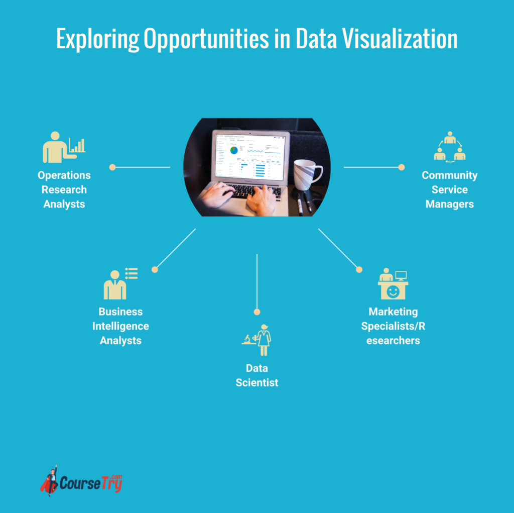
Data visualization is a rapidly growing field with a myriad of exciting opportunities for professionals. Data experts may collaborate across departments or specialize in specific areas, depending on the size of the company they work for.
Jobs where data visualization skills are essential include:
Operations Research Analysts
Operations Research Analysts are strategic problem solvers who use advanced mathematical and analytical methods. It helps organizations solve problems and make better decisions. Leveraging data visualization, they translate complex data into understandable tables, graphs, and written reports to guide management in making informed decisions. They are often tasked with conducting cost-effectiveness analyses, reviewing logistical functions, and predicting future trends.
This role calls for strong technical skills, a solid understanding of business practices, and the ability to communicate complex information to non-technical stakeholders.
Business Intelligence Analysts
Business Intelligence Analysts are critical thinkers who drive strategic business decisions by analyzing data trends and developing insights. With a firm grasp of data visualization, they create intuitive dashboards and reports that clearly communicate complex data findings to non-technical teams.
They play a crucial role in understanding market trends, assessing business performance, and guiding future strategies. These analysts require a blend of business acumen, analytical skills, and proficiency in data visualization tools and techniques.
Data Scientist
Data Scientists are the engine room for business intelligence in the modern enterprise. They process enormous amounts of raw data to extract valuable insights. With a firm grounding in statistics, machine learning, and data visualization, they build predictive models, automate processes, and create eye-catching visualizations to communicate their findings.
The role demands an in-depth knowledge of various programming languages and data visualization tools. Plus, the ability to translate data-driven insights into strategies will drive business success. In data science, understanding how to present data effectively can mean the difference between valuable insights being implemented or overlooked.
Marketing Specialists/Researchers
Marketing Specialists or Researchers are on the frontline of understanding consumer behavior through data. Using data visualization tools, they convert complex market data into easy-to-understand charts and graphs. Therefore, it helps businesses understand customer preferences, market trends, and potential growth areas. They use these visualizations to communicate their findings to the marketing team or key stakeholders in an easy-to-understand format.
This role requires a strong understanding of market research techniques, data analysis skills, and proficiency in data visualization tools. The ability to interpret and present data in a visually engaging way is crucial to drive strategic marketing decisions.
Community Service Managers
Community Service Managers are vital in ensuring the effectiveness of programs designed to uplift and support communities. They are adept at analyzing data to identify the pressing needs of communities and evaluate the success of implemented programs. Equipped with data visualization skills, they can present complex data understandably and engagingly. It enables them to effectively communicate their findings to supporters, stakeholders, and the broader community.
This role requires a keen understanding of community dynamics, strong data analysis skills, and proficiency in data visualization tools. The ability to interpret and visually present data is key to informing strategic decisions and securing continued support for community initiatives.
Frequently Asked Questions
Q: Can I find free data visualization courses online?
Yes, several online platforms offer free resources to help you learn data visualization. While these courses may not offer comprehensive training or certifications, they’re a great place to start for beginners or those on a budget. They offer a basic understanding of visualizing data, using various tools, and interpreting results.
Q: What skills do I need to become a data analyst?
A data analyst should be proficient in statistical analysis, mining, and interpretation. They should also have strong technical skills, including knowledge of SQL, Python, or R. A crucial aspect of a data analyst’s role is the ability to visualize data easily. This requires solid expertise in data visualization tools and techniques.
Q: What is data visualization training?
Data visualization training is a structured learning process that teaches you how to represent data visually. The training usually includes learning how to use software tools to create data visualizations, understanding different kinds of visualizations, and learning how to make data-driven decisions based on these visualizations.
Q: What is a data visualization nanodegree?
A data visualization nano degree is a credential some online platforms offer that signifies an advanced understanding of data visualization. This nano degree typically includes coursework in creating dashboards, visualizing real-world data, and creating narrative structures around data. It’s often pursued by professionals wanting to upgrade their skills in the data field.
Q: How valuable is a data visualization certification?
A data visualization certification can provide a significant boost to your career. It validates your skills in this growing field and can make you more attractive to employers. With this certification, you demonstrate a firm understanding of key concepts and tools used for data visualization. It highlights your ability to turn complex data into clear, actionable insights.
Final Words
Data visualization is an invaluable tool for transforming complex data into visuals that are easy to understand. It’s a powerful skill that can unlock exciting opportunities in the market. With the right online courses, you can become proficient in using data visualization techniques to inform important business decisions, enhance marketing campaigns, and gain insights into customer behavior. So why not take the plunge and unlock the potential of data visualization today?
We are committed to providing our users with unbiased and honest reviews of various courses to help them make informed decisions about their education. Our career roadmaps are tailored to specific industries, providing a clear path to success in various fields.
In addition to our course reviews and career roadmaps, we offer a wealth of articles covering a range of career-related topics, from resume writing to interview tips to workplace culture.
At coursetry.com, our mission is to empower individuals with the knowledge and resources needed to advance their careers and achieve their goals. Our platform is constantly evolving and expanding to better serve our users, and we are dedicated to providing the best possible experience for everyone who visits our site.